
Klick-ass network systems
HCD Consulting plans, builds and optimises high-performance network infrastructures for corporate clients – independent of manufacturers, tailored to real needs. From initial analysis to full rollout, the focus is always on two things: technical precision and human connection.
Because strong networks aren’t just built on specs – they’re built on trust. Whether it’s long-term optimisation or urgent firefighting, HCD is there when it matters. Transparent. Reliable. On point.
In short: powerful networks. Made with and for the customer.

Creating a brand ecosystem
The created logo is part of a shared brand universe that visually connects the companies HCD Consulting, Green IT Solution and PromoData. Each logo features a stylised, organic symbol – from branching circuits to abstract blossoms – reflecting a networked, sustainable approach to technology.
HCD’s symbol is inspired by the composite flower head – a tightly packed cluster of smaller blossoms working together. Like in a network, each individual element enhances the performance of the whole system. And just like a flower never exists in isolation, the metaphor scales: HCD considers both the micro-connections between components and the broader ecosystem of collective performance that shapes the infrastructure.
This botanical analogy carries through the entire visual system – combining structure, adaptability, and the strength of a network that thrives through connection.


Design concept
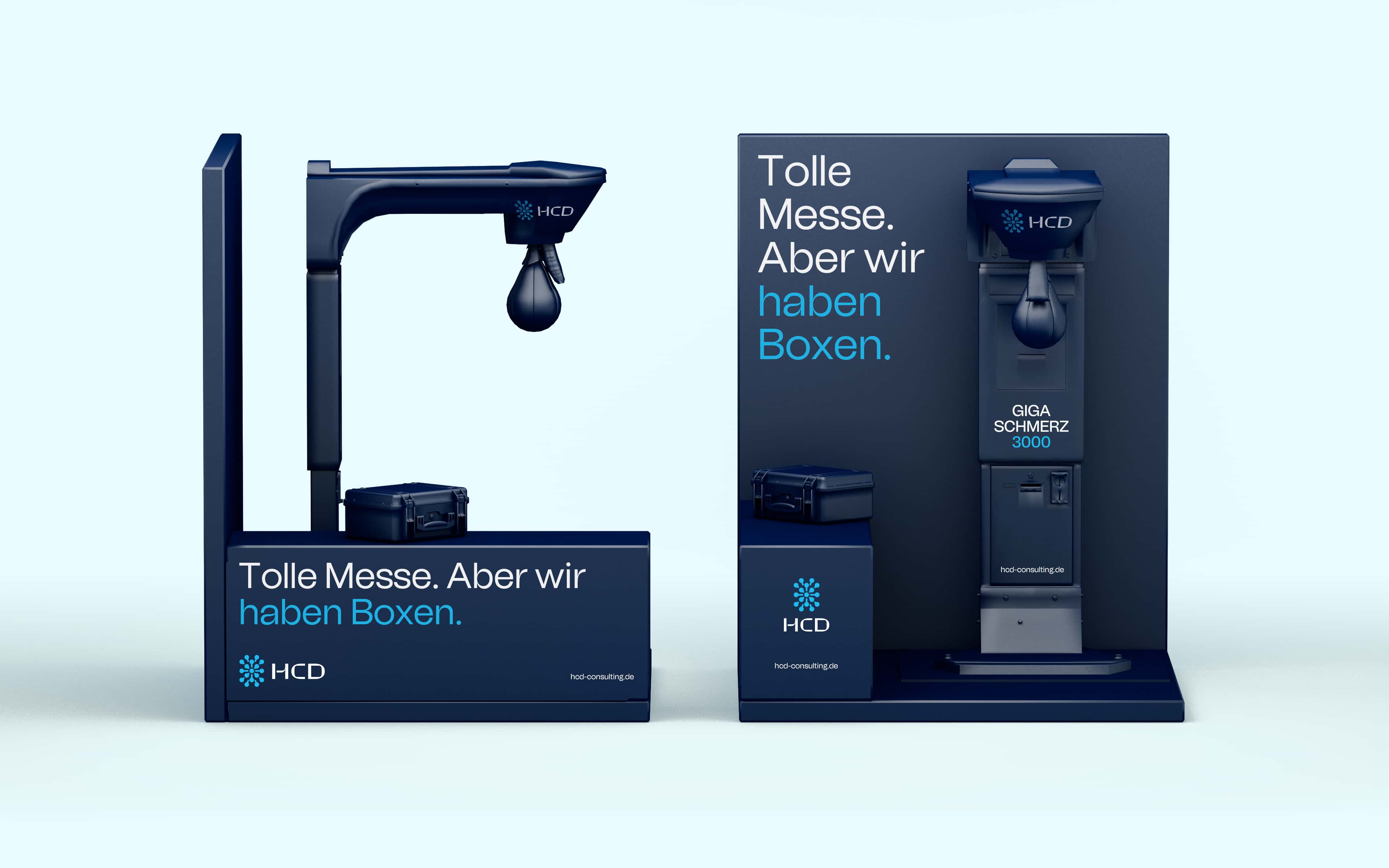
The visual identity achieves this balancing act between ice-cold, technical reliability and interpersonal connection. The general visual tonality of the design language forms the character pole of reliability. A spectrum of different shades of blue and a tiled, modular layout communicate reliability and technical precision. The accurate 3D-illustrations also communicate technical systematics and rational clarity.
In contrast to the visual level, the brand communicates completely differently in terms of content: surprising, playful, sometimes provocative. Without technical blah-blah and abstract bullshit bingo. This level of brand communication comes to life through real images and stories that everyone can relate to. In this way, we fill the HCD brand with small stories and thus strengthen our goal of being perceived not just as another IT service provider – but as a partner with a strong personality and people who really care.
Only the corporate typeface Tomato Grotesk (The Designers Foundry) combines the two faces of the brand personality as a straightforward grotesque font with curved humanistic details and at the same time builds a visual bridge to other brands in the group of companies (Green IT Solution).


HCD Consulting GmbH
Visual identity, trademark, brand architecture, business stationery, copywriting, UI, motion design, campaign design
Ready to be remembered?
Tell us what you need and we will reach out to you. We are looking forward.
Work with us2-Person Studio for Branding & Frontend in Munich – helping you become Ay Caramba.


Ready to be remembered?
Tell us what you need and we will reach out to you. We are looking forward.
Work with us